Pieno Pieno

HMI Printer

IMAGO • Printing

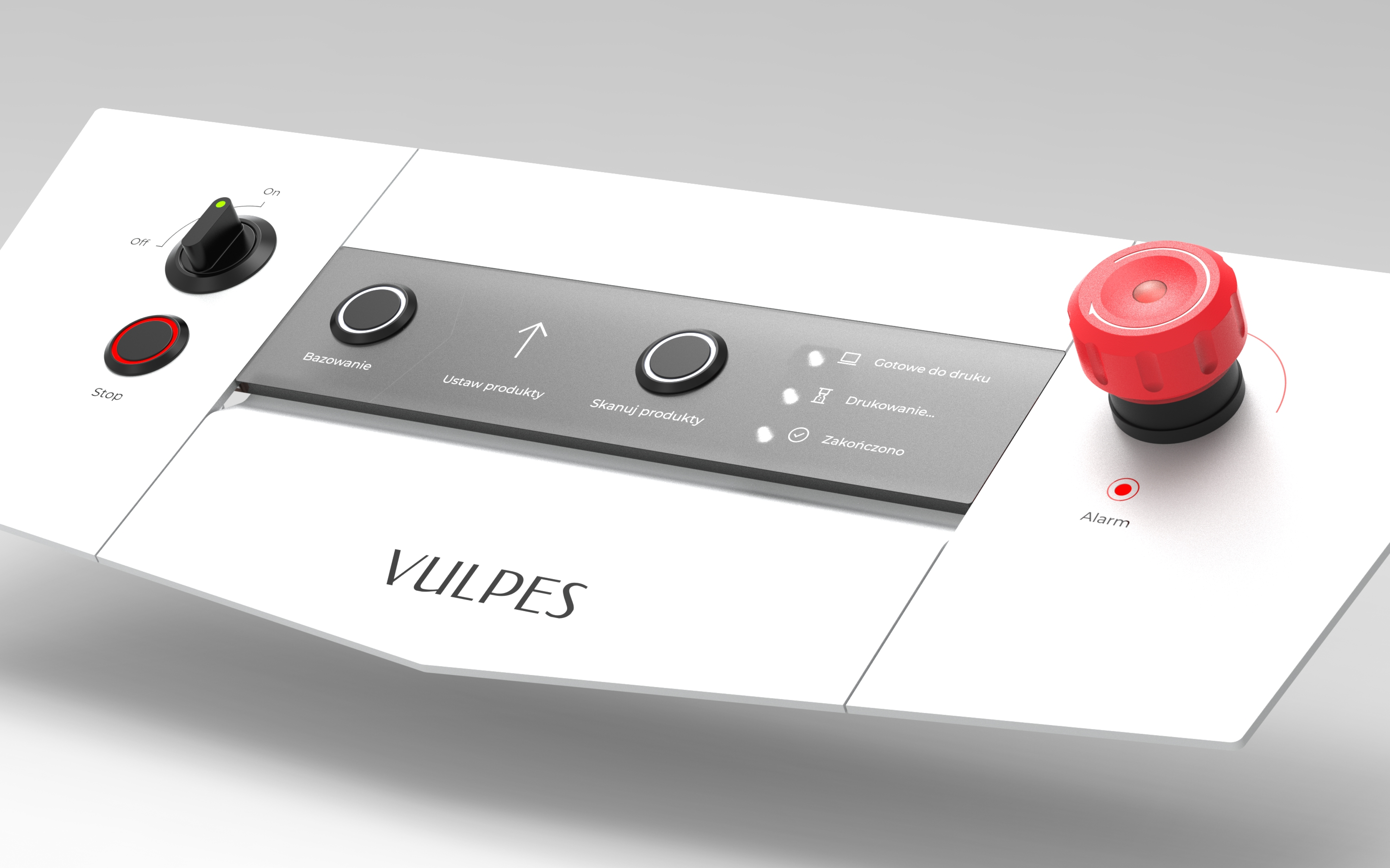
Pieno was tasked with redesigning the control panel for Imago printers. The goal was to create a more intuitive, efficient, and accessible interface that would enhance the user experience and improve overall productivity.

  • 1. User Research

    - Workshops and Observations: Our team conducted in-depth workshops and observations with printer operators to understand their daily workflows, pain points, and needs.
    - Interviews: We conducted one-on-one interviews to gather qualitative data on user preferences and expectations.
    - Ergonomic Testing: We conducted ergonomic testing to identify any physical strain or discomfort experienced by operators.

  • 2. User Research - conclusion

    - Operators often struggled with the complexity of the existing control panel.
    - The interface was not intuitive, leading to errors and increased training time.
    - The panel did not accommodate users with different abilities or levels of technical expertise.

  • 3. Analysis and Synthesis

    - Goal Definition: The primary goals of the redesigned panel were to increase efficiency, improve ergonomics, simplify operation, and differentiate Imago printers from competitors.
    - User Segmentation: We identified three primary user groups: production operators, technicians, and non-technical personnel.
    - Feature Prioritization: We determined that the panel should include both basic printing controls and more advanced features for managing the printing process.
    - Competitive Analysis: We analyzed control panels from other printer manufacturers to identify best practices and areas for improvement.
    - Brand Alignment: We ensured the design aligned with Imago's overall visual identity and brand values.
    - Materials and Technology: We researched materials and production technologies that were durable, aesthetically pleasing, and cost-effective.

  • 4. Design

    - User Journey Mapping: We created a visual representation of the user's journey to understand the steps involved in interacting with the panel.
    - Information Architecture: We developed an information architecture that organized content in a logical and intuitive manner.
    - UX/UI Design: We applied UX/UI design principles to create a user-friendly interface.
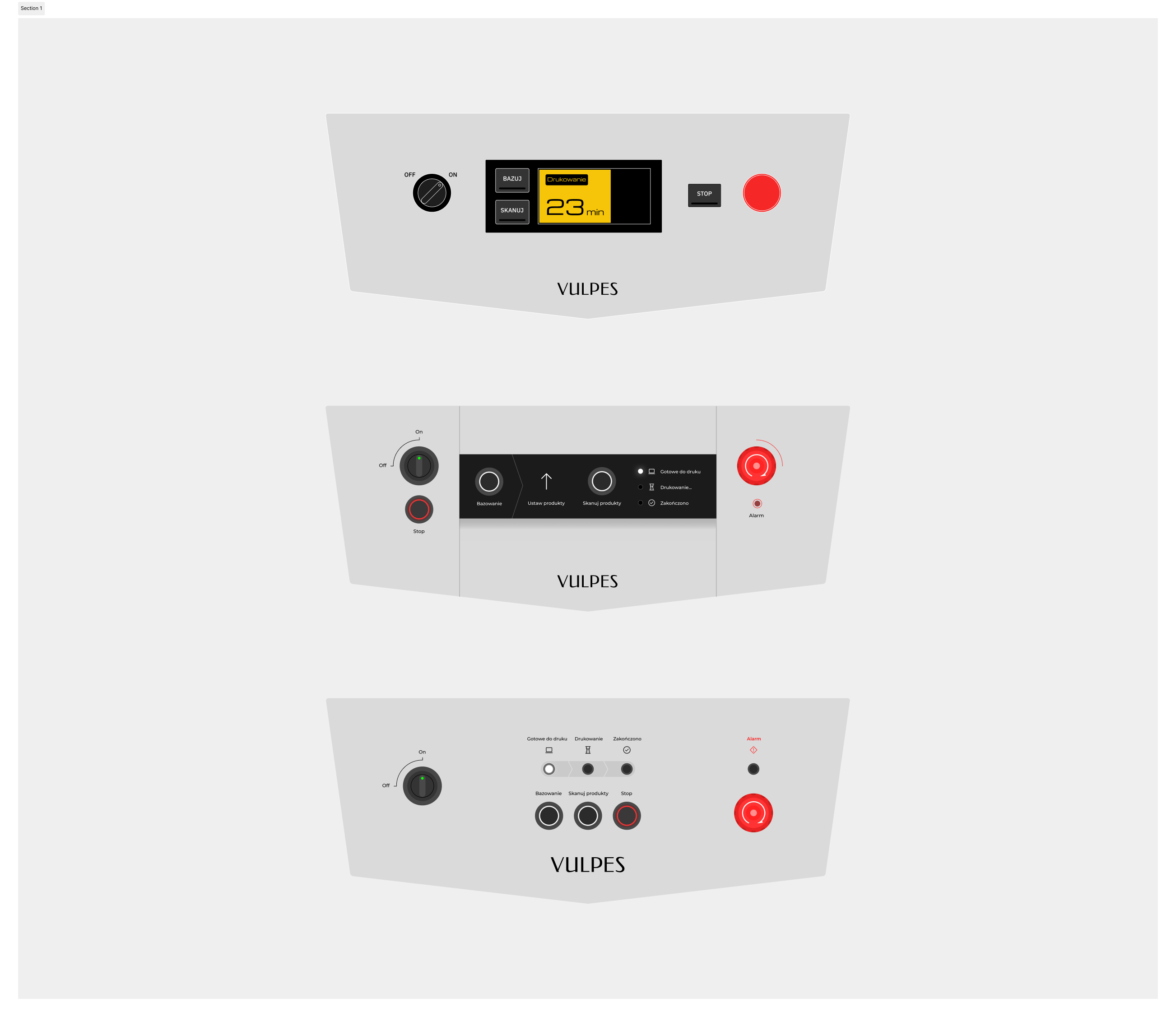
    - Concept Development: We created two distinct design concepts, each with unique visual and functional characteristics.
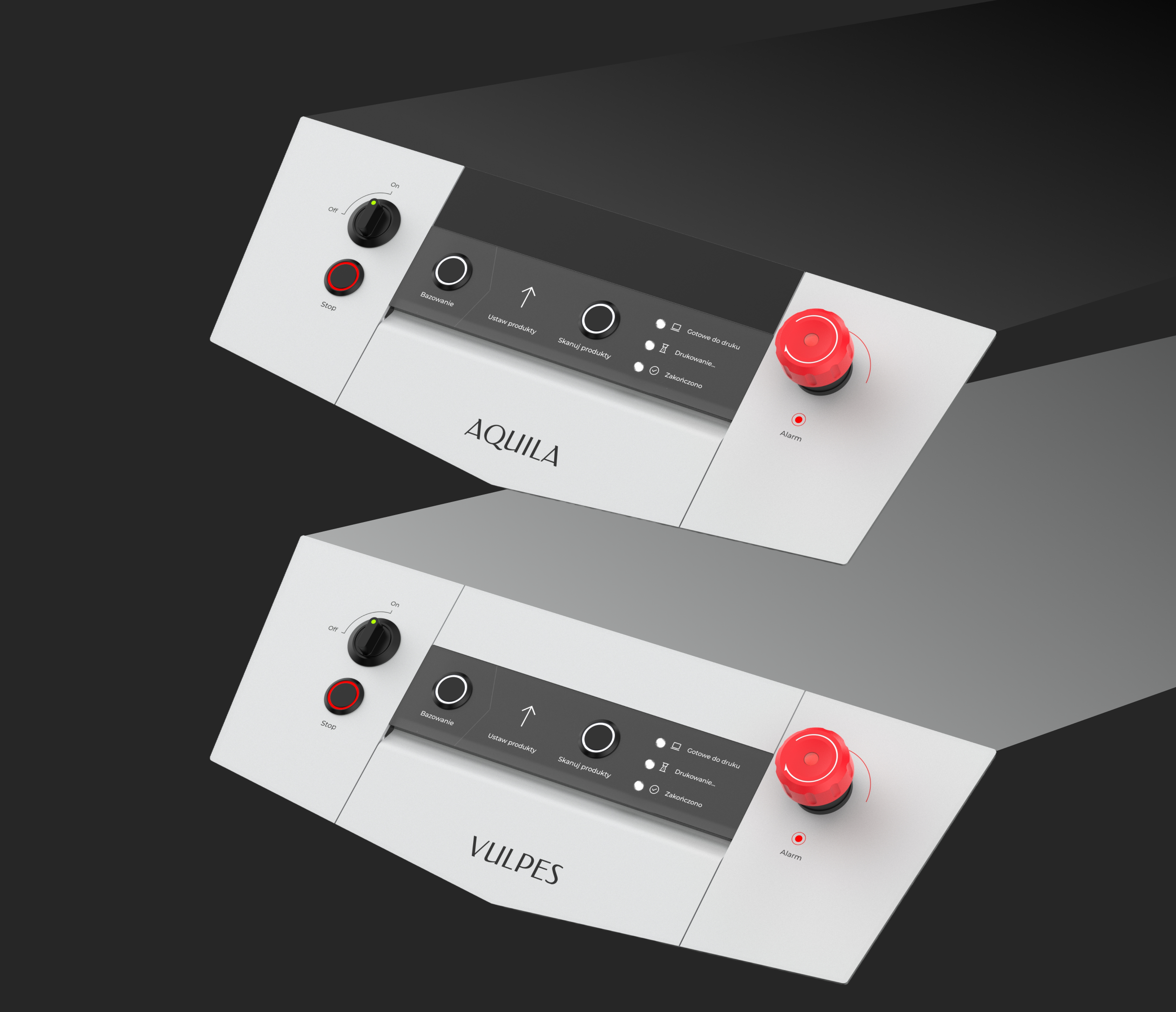
    - Component Design: We designed custom graphic elements to differentiate between different printer models.
    - Hardware Selection: We selected appropriate switches and buttons from a variety of suppliers.

  • 5. Visualization and Delivery

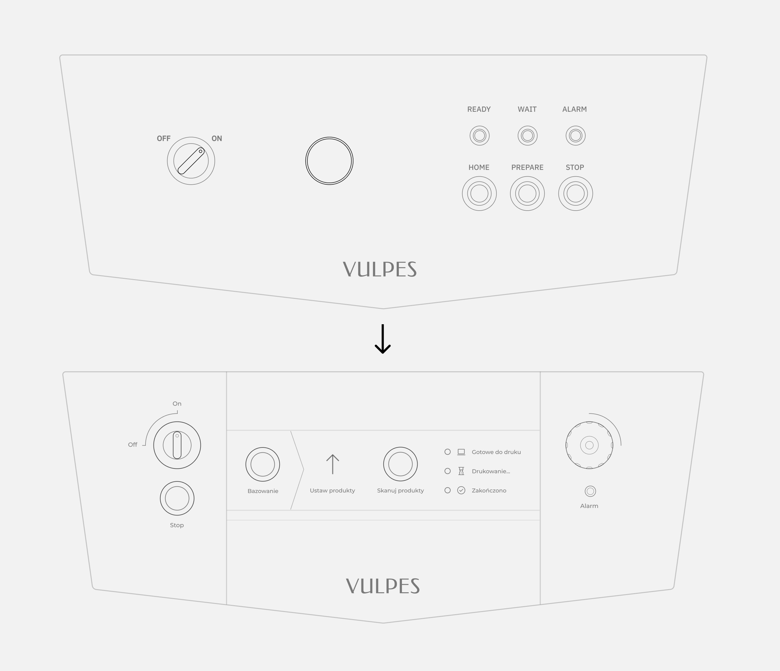
    - 2D Visualizations: We created 2D visualizations to illustrate the layout of the control panel.
    - Design Specifications: We provided detailed design specifications for implementation.

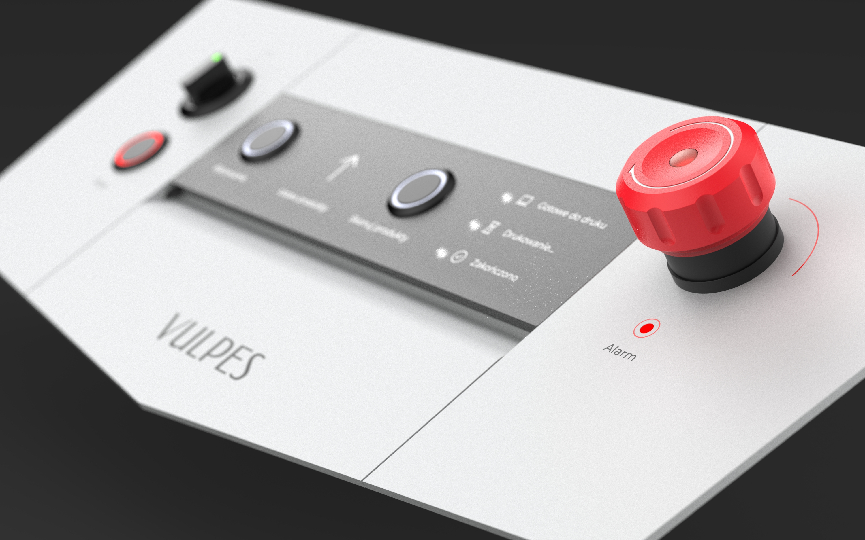
We have introduced a number of changes aimed at lowering the entry barrier for people just starting to work with printers. We have reduced the need for remembering information for users who are less familiar with technology.

We suggested aligning the changes with the company’s strategy. During the project, we noticed significant potential for incorporating an additional screen, which could greatly enhance both the usability and aesthetics of the product. We also identified opportunities to adapt the current interface to the new components we proposed, enabling the client to improve the interface as quickly as possible.

Two versions of the interface were created for two types of machines – one for a food-grade machine with a stainless steel countertop and another for an industrial machine with a black countertop.

The redesigned control panel successfully addressed the challenges identified during the user research phase. It is more intuitive, efficient, and accessible, leading to increased user satisfaction and productivity. The panel also reinforces Imago’s brand identity and sets it apart from competitors.

Final result

Final result

Improved user experience

Increased efficiency

Reduced training time

Enhanced accessibility

Strengthened brand identity